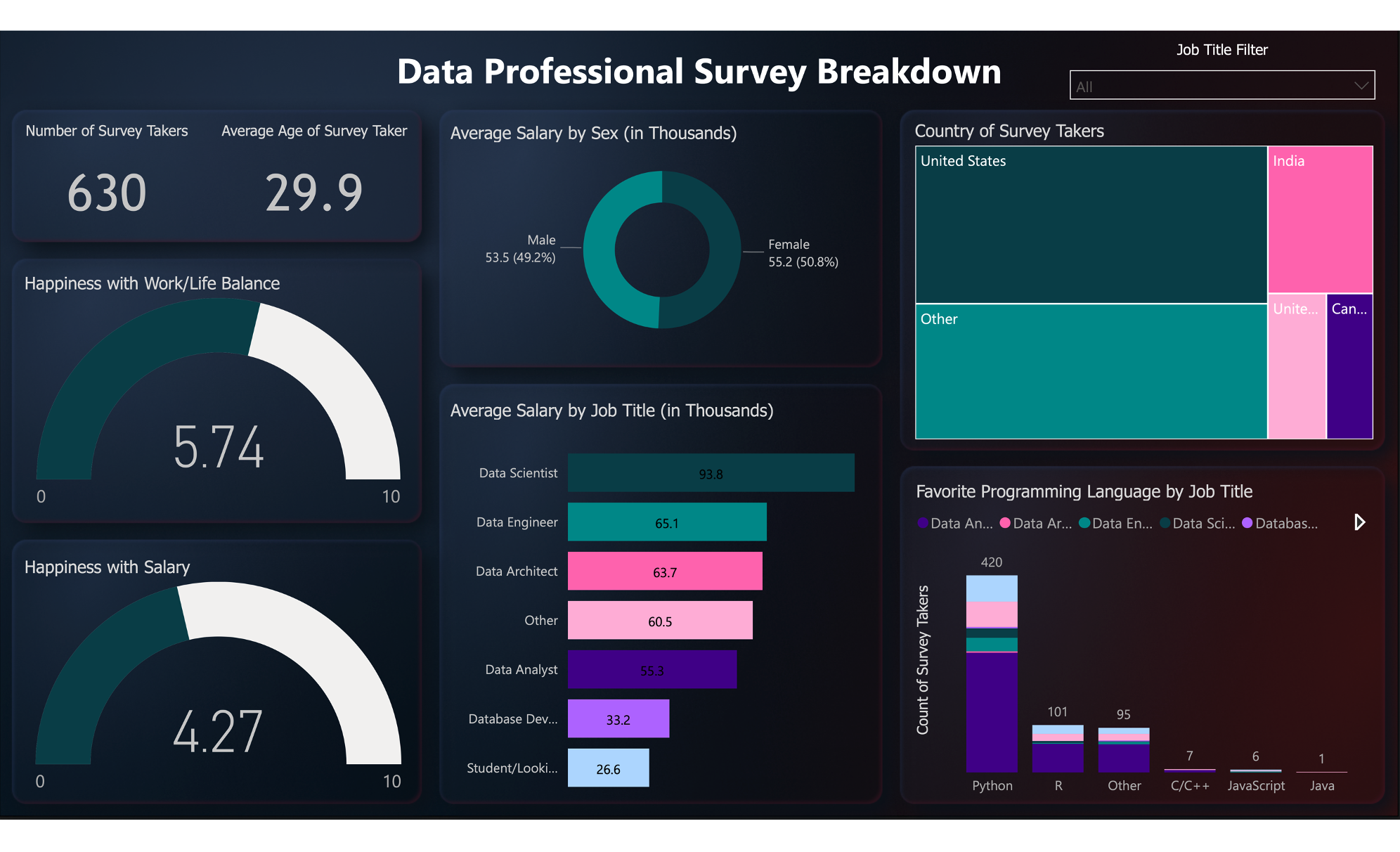
DATA PROFESSIONAL SURVEY BREAKDOWN IN POWER BI
An interactive Power BI dashboard showcasing data professionals' salary, work/life balance, and programming language preferences. Designed with a professional background using Figma.
Clicking on the image will redirect you to my GitHub page where you can download the file.
This is an interactive dashboard that displays the results of a survey conducted among data professionals. The dashboard includes information about their average salary, satisfaction with work/life balance and salary, as well as their favorite programming languages based on job title. To enhance its professional appearance, I used Figma to create a custom background.
I apologize for using image of the dashboard instead of the real one. This was due to the limited embedding policy of Power BI.